You have worked hard to get visitors to your website, so don’t ruin all that effort by having web pages that perform poorly. Invest your time in planning each webpage, asking every time will visitors to this page take the action I want them to take? Will this page convert well?
There are thousands of things you can do to a website that will effect its conversion rates. Below are simple conversion rate tips to help you get started:
Who you are. What you do. Problem you solve.
Your website should tell who you are & what you do and what problem you can solve. Make it obvious what your website is about.
In 2014 Tony Haile, CEO of Chartbeat analysed user behaviour across 2 billion visits across the web over the course of a month. He found that most people who click don’t read. In fact, a remarkable 55% spent fewer than 15 secondsactively on a page! This means your webpage has literally seconds to grab somebody’s attention and convince them to stay and take action. They need to know straight away what your site is about. If you confuse them, then they will leave.
How can the visitor benefit from your website? Make it obvious to them. One easy way to do this is to have a prominent headline on your website that defines what you do. Most visitors to your website will only stay for a few seconds and if they can’t quickly find what they want then they will quickly leave.
Keep in mind that not all visitors to your website will arrive on your homepage. For example, they may have clicked a link following a Google search and end up on one of your product pages, so again all of your pages need to make it clear what your site is about.
For example, the webpage below shows the landing page for the Caleb Wojcik video course – it uses a headline that clearly states what it offers – visitors can immediately understand what the webpage is about – “Learn how to shoot better videos by yourself” – and it straight away lets them know if it’s what they’re looking for:
Have a clear goal for each page
Make it obvious what people should do on your page. Reduce distractions, and make sure each page if focused on encourage visitors to take a specific action.
For example, if you want people to sign up for a free trial then focus you content only on that – either keep other links on the page to a minimum or eliminate them – and make the button stand out which says e.g. “Sign up here!”. Don’t distract people.
Another example would be if you are selling a product – provide professional images, making it clear & prominent what is being offered. Be consistent with the colours on your webpages and use a different colour for your something you want to draw people attention to e.g. your “Buy Now” button
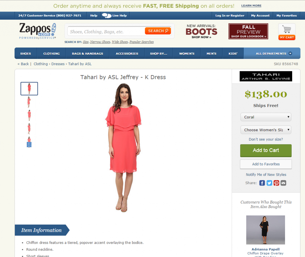
For example, the online retailer Zappos does a lot of split testing to see what works best in converting visitors into customers. You can see from their website below that they maintain their blue & beige colours throughout their site, but if they want to draw peoples attention to a specific area – in the hope it will encourage the visitor to take action – such as making a purchase, then they use a different colours to help grab their attention.
In the screenshot below, for individual product sales pages Zappos use green for prices and the Add to Cart button. Plus throughout the site they use orange buttons for the SEARCH and MY CART buttons. By using different colours they are able to highlight specific, important areas that will help draw peoples attention:
Make price obvious – don’t hide it
If people are going to buy then they will want to know the price. If you they are forced to click away to another page to hunt around for the price, then this will put them off. Make it easy for them to have the information to hand. The more clicks a visitor has to make, the more likely they are to drop out.
Keep your message clear. Keep your pages simple.
Sometimes less is more. This is often the case with webpages. Only include the information required – no more, no less. Don’t include a lot of irrelevant text – people don’t read the small print. Minimise white space – it’s taking up valuable space.
How short or long your page should be will depend on the amount of information it requires to get your message across, and explain your product/service, etc – there is no fixed rule for the length of a page.
Cut out the jargon – clear, simple language is better. Using complicated business language won’t do you any favours. Don’t write for companies, write for people.
It’s recommend that you familiarise yourself with good copywriting practice or hire a copywriter to write the text on your website. Understand your audience and write for them.
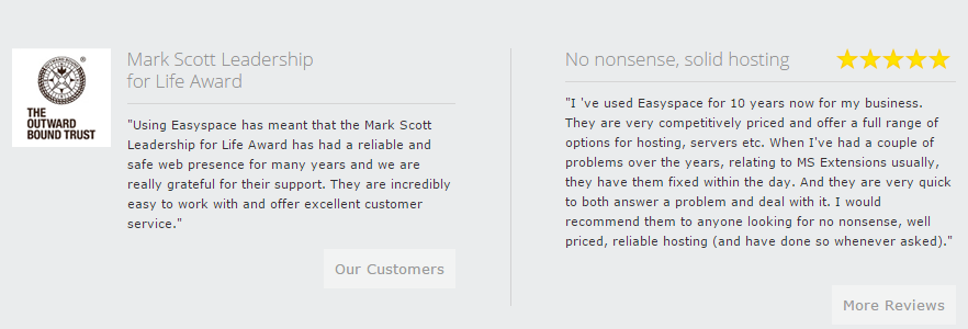
Include testimonials on pages
Testimonials (reviews and comments from your satisfied customers) provide “social proof” to potential customers that you can be trusted. They help potential customers decide that they should make a purchase from you. They can help overcome any sales barriers people may have, because they give your website credibility.
Halo Effect – Payment Logos
The Halo Effect is a well documented social-psychology phenomenon that causes people to be biased in their judgements by transferring their feelings about one attribute on something to other, unrelated, attributes.
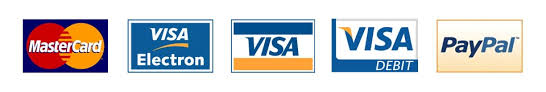
One way many e-commerce website take advantage of the ‘Halo Effect’ is by including the logos of various trusted, high profile payment providers such as VISA, Mastercard, Paypal, American Express, etc. So, if you accept payments via your website then make sure you include logos for Paypal, Visa, Mastercard, etc on your pages, as they will give your website more credibility.
Every page should have contact info
Include your phone number on every page and if possible offer a ‘live chat’ option. Making it easy for people to contact you (whether they actually do or not is not the point) will help increase conversion and create customer loyalty.
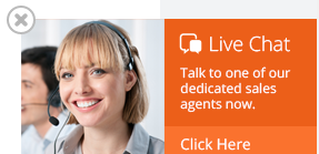
Some customers may feel more comfortable knowing that help is close at hand, which will help convert a sale since they know support can be quickly accessed if required. Some people like to ask a few quick questions before making a purchase, so by having your contact information clearly displayed, it will help conversion rates.
Read more The brilliant methods to maximize mobile conversion rate
_______________________________________________________________________________
For more details about our seo service packages, pls contact us
BIGBIGSEO Team
Email: bigbigseo@gmail.com
Skype: bigbigseo
https://www.facebook.com/bigbigseo
Thank you!