A good landing page should be simple. Provide the necessary information that visitors need in order to feel confident to hit that buy button. Make information concise as to not overwhelm visitors and use bulleted lists to make essential info easily scannable.
Before you even create your landing page, think about what information a visitor needs to have before they convert. Then, map out how you’re going to communicate all that information to your visitor in a clear, entertaining way.
Is it going to be a video? Graphics? Plain copy? Figure out what the barriers are going to be for your potential customers, and how you might address those on the page. If you create a clear path to conversion, customers will follow it.
However, do keep in mind that these initial plans are simply hypotheses. The only way to prove or disprove the effectiveness of these decisions is by testing every change to ensure an optimal conversion rate. If your hypothesis is that a video will convert better than an image on your landing page, then make sure you A/B test this first to gain the data to support your decision.
1. Tune your page for your specific customer. You are fundamentally designing an experience for this person. With that in mind you can craft the most appropriate message to get your desired response.
2. Simplicity in design is paramount. Clean pages with easy to read text and an easy to digest offer will keep the attention of your visitors. In some cases though there might be a need for more in-depth information where it is expected or desired by the visitor.
3. Design the page to encourage a conversion event—be it completing a form, calling your organization by phone, engaging in a chat widget conversation, downloading a whitepaper, subscribing to a newsletter or making a purchase. This factor is crucial in determining your ROI.
4. Make your forms short. Just request the info that you need and no more. This will increase your conversion rate, but may not give you the highest quality leads, so you will need to gauge that according to your target audience.
5. Limit the number of external web links on the page. Distracting links can sidetrack your visitor, so be judicious with the number and destination of links. Removing main menu and footer links is a strategic step in modeling a decision-making flowchart for visitors.
6. Send traffic to dedicated pages that reinforce the offer. Traffic going to the home page is akin to starting at square one for the visitor—this can upset momentum, and lose prospects. Elaborate on the offer and add more persuasive content with reasons to convert.
7. Create separate landing pages depending on the source. Your different channels will determine the landing page content and any subsequent target pages can be optimized for that channel. This helps with testing and measurability.
8. Test your landing pages. A/B Testing different pages can help you find the sweet spot. Understand statistical significance to be sure that your tests mean what you think they mean. Measure by setting conversion goals in Google Analytics and keep track of key metrics such as live chat connections, email newsletter subscriptions and forms completed.
9. Plan your follow-up response. Whether this is a simple phone call in reply to a form or a sophisticated email campaign designed for converting customers, a proactive approach is required to make this a seamless and “natural” step in the communication process. Also, any response should be timely and appropriate to the offer. It is also your opportunity to extend the conversation.
10. This step can’t be understated—always subscribe to white hat SEO practices. Gaming the system can only be a temporary win and penalties from search engines can be draconian and negatively impact your business in the long term. Keep abreast of the “rules” as they change regularly as search engines become more sophisticated.
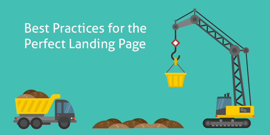
The overall layout of your landing page has a major effect on the number of conversions your business will receive. It’s important to design your page with the main focus of your business in mind: making it easy for visitors to connect with what you are selling.
Shoot for easy navigation with a clear hierarchy – using strong contrasting colors to separate between background, foreground and call-to-action buttons. The users should know where to go clearly and easily.
Finally, Just Call to Action
Visitors navigating your site will always want to know what to do next. Be direct, clear and assertive with your call-to-action buttons. Using a strong command verb with a sense of urgency is proven to increase user responses. Use it!
Once upon a time, the general consensus on call-to-action (CTA) buttons was to place them all above the fold to make sure they’re instantly viewed by the visitor. However, the optimal placement for your CTA button, much like the length of your page, depends heavily on the nature of your product and the stage of your business.
For example, more established companies and brands have the luxury of attracting visitors who have largely decided to convert before even visiting the landing page. For example, a significant portion of visitors to Twitter’s landing page are most likely there with the intention of signing up for an account. In these cases, it makes sense for the CTA to be placed above the fold to make it easier for the visitor to convert as fast as possible.
This also applies to landing pages designed for warm leads or visitors already acquainted with your business. Placing CTA buttons above the fold for such landing pages is generally best practice, provided it is accompanied with a compelling headline and some helpful information about the business and its potential value to the visitor.
Conversely, if your product or service requires the visitor to make a larger investment of money or time or is entirely new to the visitor, it might make sense for the CTA button to be further down the landing page. The user will likely need more convincing information before making a decision to convert.
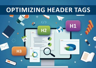
Read more Awesome tips to optimize SEO Friendly Content Writing
_______________________________________________________________________________
For more details about our seo service packages, pls contact us
BIGBIGSEO Team
Email: bigbigseo@gmail.com
Skype: bigbigseo
https://www.facebook.com/bigbigseo
Thank you!